How To Make a Compare and Contrast Chart on Google Docs
You might want to use charts to help illustrate your points. Google Docs has a few features that make adding these elements easy. So, how can you include a compare and contrast chart in Google Docs?
First, users will need to select Insert, then Drawing. Next, choose an oval shape to add a circle. Copy and paste to create a second circle and merge them, creating an overlap in the middle. Finish by using text boxes to add words to the Venn diagram.
Compare and contrast charts might look complex. But they are relatively easy to create within Google Docs. Keep reading to learn the steps needed to create these images quickly.
How To Draw a Venn Diagram In Google Docs
One of the most common ways to compare and contrast two items is with a Venn diagram. You will need to draw this manually. Here are the steps to follow when doing this:
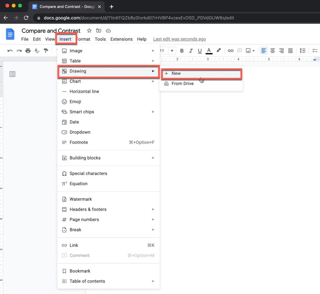
- Select Insert -> Drawing -> New. This will create a pop-up window where you can make your Venn Diagram.
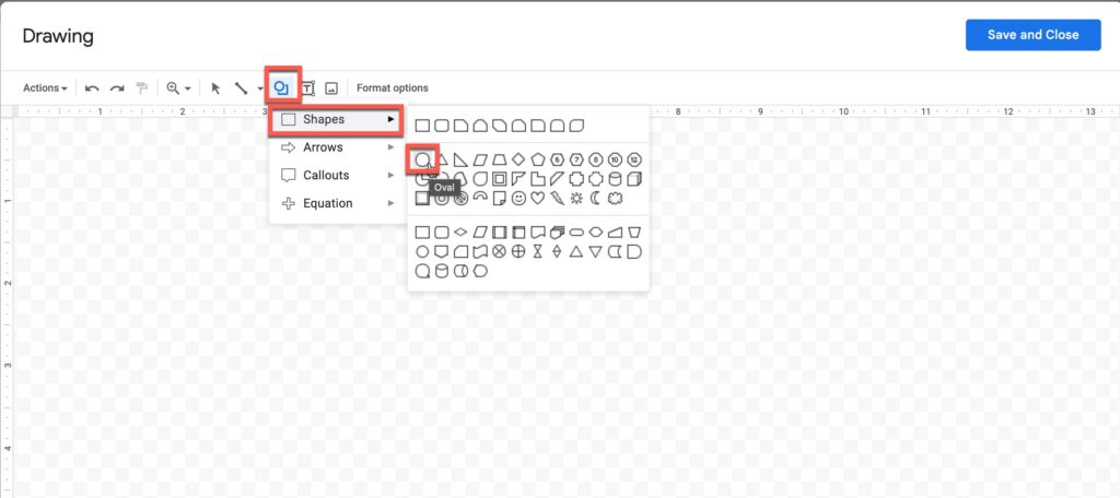
- Use the Shapes tab to add the circles. The Shapes tab will contain a circle option. You can use this to add two overlapping circles to create the diagram. As you are doing this, consider the size of the circle. There should be enough overlap to allow you to write all your information.
- Align the circles. It’s a good idea to copy and paste the first image. This ensures that both circles are the same size. You can also use guidelines, to ensure that they are overlapping neatly.
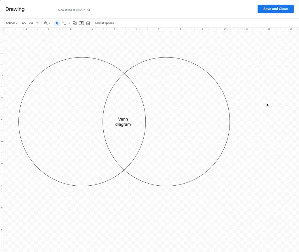
- Use a Text Box to add the information. You will be able to type information into the Text Box, then drag the box into its place on the chart.
- Adjust the chart. If you want, you can make some finishing touches. For example, you might want to change the circle’s color or adjust the text’s size.
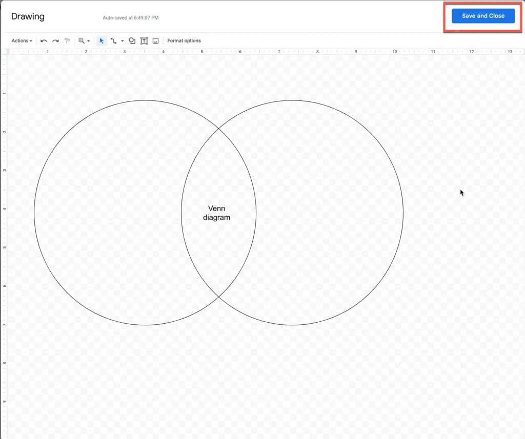
- Select Save and Close. This will cause your drawing to appear in your Google Doc. You can then move it around and adjust the sizing. If you want to edit the chart further, you’ll need to double-click it. This will return you to the editor tab.
For this method to work, you must use Google Docs on a desktop computer. The drawing tool might not work on mobile devices.
It should be noted that there are a few other places where you can create the chart. For example, some people prefer to work within Google Slides. You can copy and paste the diagram to transport it to Google Docs.
Adjusting Your Venn Diagram
Once you have made the Venn diagram, you might want to change the settings to adjust how it looks. Here are some suggestions that you might want to explore:
- Changing the color of the circles. You might want to have two different colors for each circle. You can then have the overlapping space in the center as a blend of the two colors.
- Checking the text color. If you are using colored circles, it’s essential to ensure that the text is still readable. This might mean changing the color. You can also adjust the size and font. Sometimes, you might want to consider using images, instead of words.
- Keep it simple. Try to limit the amount of text you are using. This ensures that it’s easy for the reader to quickly understand your Venn diagram’s main messages.
The good news is that it is relatively easy to adjust the images within Google Docs. This ensures that you get a visually striking compare and contrast chart.
Creating A Compare And Contrast Chart In Google Sheets
If you have a lot of numbers you want to compare, or you want to incorporate several numbers into the chart, you might want to use Google Sheets. Here are the steps to follow to create a compare and contrast chart in Google Sheets:
- Add the data. To create a compare and contrast graph you will need to have at least two variables. Though, you might want to add more.
- Select which cells to include. Next, you need to decide which data to include in the graph. This is done by highlighting the cells you want.
- Select Insert then choose the Chart option. This will bring up a range of chart types to explore. Select the one that you want, then tap Done and the chart will be automatically generated. If you prefer you can adjust the settings of the graph to adjust its appearance.
Once you have made the chart on Google Sheets, you should be able to copy the image and paste it into your Google Doc. Once there, you can edit the image slightly. For example, you can resize or change the orientation.
Furthermore, this method should work with other apps. For example, you might want to use Microsoft Excel to create the graph, before copying it into Google Docs.
Recommended Home Office Products
[amazon table=”17112″]
Using Third-Party Tools To Create Charts
There are several third-party tools that you can use to create the charts. How you take this approach will vary. Some third parties will require you to use the tools on their website. You can then copy and paste the images into your Google Doc.
At other times, though, the tool might be able to integrate directly with Google Docs. These are the steps you will need to follow to integrate the add-on:
- Select the Add-Ons tab at the top of the page.
- Hit Get Add-Ons in the drop-down menu
- Use the search function to find the one you want
- Hit the install button
Each third-party tool will have a slightly different method to follow to create a compare and contrast chart. Thankfully, most will be fairly straightforward.
Final Thoughts
Unfortunately, there aren’t any Venn diagram templates in Google Docs. This means that you will have to draw your own. Thankfully, this is a fairly straightforward task, which can be done in Google Docs or through third-party software. In most cases, you should have a beautiful chart within 30 minutes.
Sources
https://support.google.com/docs/answer/63824?hl=en&co=GENIE.Platform%3DAndroid
https://www.lucidchart.com/blog/how-to-make-a-venn-diagram-in-google-docs
https://www.howtogeek.com/836333/how-to-make-a-venn-diagram-in-google-docs/