
Does Font and Font Size Affect Reading Speed?
Choice of words for a writer is a powerful tool to secure the attention of its reader. But have you ever wondered that besides the selection of words, what other factors make your piece of writing engaging? Scientists have proven that typography (font selection and size) plays a vital role in learning, memory, attention, reading, and thinking.
But does font and font size affect reading speed? Some studies have shown that the choice of font and font size does affect reading speed. Whether it makes it easier to read, hence faster, or vice versa – it all depends on numerous factors. Out of those factors, perhaps the most important one is the reader himself, and to which age group they belong.
Font and font size are components of a bigger family called Typography. Typography is an important element that plays an important role in making or breaking a written piece. The structural elements that determine readability are:
- Typeface
- Font
- Line length
- Leading
- Kerning
- Tracking
If you are looking for books to read, you should really sign up for Kindle Unlimited. Kindle Unlimited has a huge library of books, audiobooks, and magazines. To learn more about Kindle Unlimited, click the link below:
Kindle Unlimited – Unlimited Reading, Unlimited Listening, Any Device
If you are more of an audiobook person, Audible is for you. Audible has a huge library of audiobooks on a variety of topics and listening to audiobooks is a great way to learn on the go. Audible includes podcasts and Audible Originals as well. For more information on Audible, click the link below to get your first 30 days on Audible for free:
Audible – Your First Audiobook is On Us
Typeface
There are known to be two kinds of typeface; Serif and Sans Serif. The effects of these two typefaces are quite different from each other when it comes to readability, and no research or study has given any conclusive results as to which one expedites the course of reading. Readability of a text is resolved by four factors; words per minute (WPM), saccade length, fixations, and regression percentage.
Serif
In typography, serif fonts are distinguished by a stroke or small line extending from the beginning or end of letters. In a more casual way, they are said to be feet of the letters. According to some studies, including the ones conducted by Morrison and Noyes show that in some cases Serif tends to make it easier for the reader to comprehend.
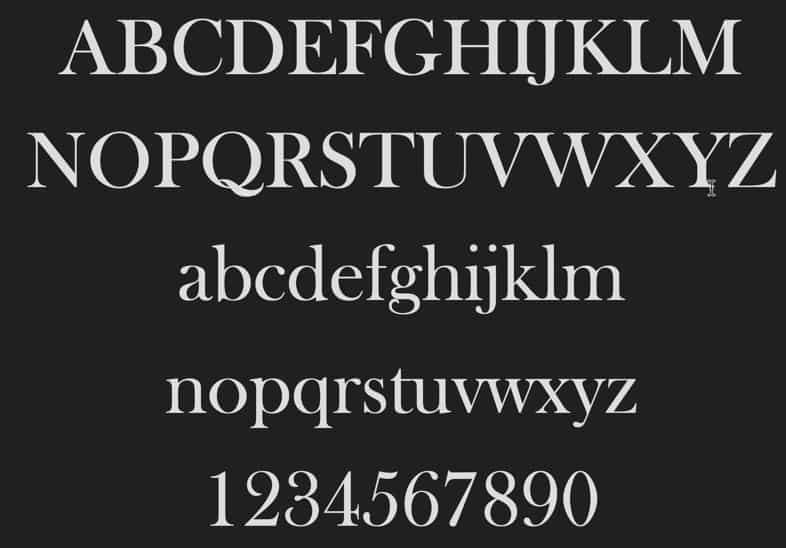
They accredit it to the curves and tails at the end of these letters that make each letter distinct, hence easy to discern and read. They also resemble a handwritten note more than a digital type, therefore making it easy for the reader to comprehend. Talking in the terms of elements that determine readability, this means that Serifs attribute to longer saccades, minimum fixations, greater words per minute and lower number of regressions.
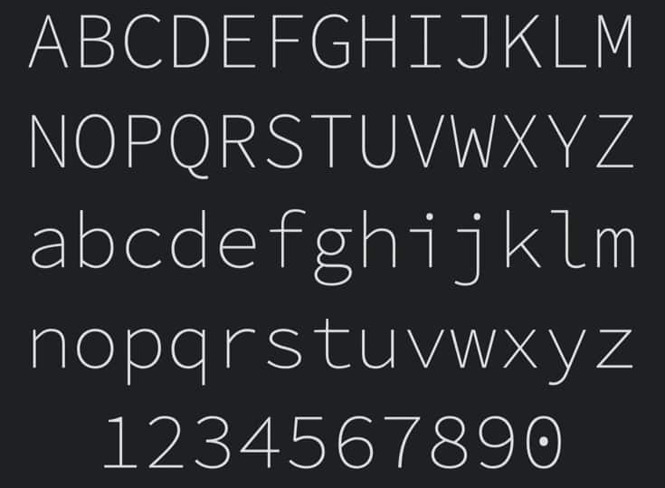
San Serif
San Serif is the font that is without the serifs; it is modern, minimal, and consumes less line width as compared to Serif font.
It is widely acknowledged that San serif is easier to read font than Serif when it comes to the web. Serif font, due to its curves and tails as an extension, makes it harder to read, and offers more visual detail for the brain to process. On contrast, san serif is easier to read on desktop screens because they are less complex and easily processed by the brain.
Because san serif is simple and minimal, these features make the font legible even in smaller point sizes. Serif typefaces usually create visual noise on low-resolution screens, which results in distraction for the reader.
Fonts and Font Size
Contrary to common belief, font, in fact, means the characteristics of a typeface. In simpler words font stands for the weight, style and specific size of a typeface. The font directly determines the reading speed and capability of a certain age group. For older people high point font such as 14 is preferred to a 12 point font. Moreover, they find it easy and faster to read content in serif instead of san serif.
Kids, on the other hand, find 10 to 12 point fonts more legible and can read through faster.
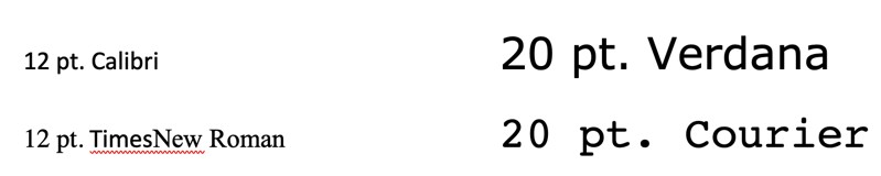
A study by Bernard et al gave a detailed insight into the effects of 8 popular typefaces and their sizes. The fonts under analysis were Century Schoolbook, Courier New, Georgia, Times New Roman, Arial, Comic Sans, Tahoma, and Verdana. The font sizes that were compared were 10, 12, and 14 points.
The results looked like this:
- At 10 point size, Verdana was the most favorable font
- At 12 point size, Arial was the most favorable font
- At 14 point size, Comic Sans was the most favorable font.
Upon monitoring the reading time, it was concluded that content written in Times New Roman and Arial were read much faster in comparison to the rest of the fonts. Considering the legibility it was observed that Tahoma at font size 10 excelled to be the most legible, followed by Courier at font size 12, and Arial at font size 14. Nevertheless, it is not proven that bigger font size means faster reading and better legibility.
How the Change of Font Affects Speed of Reading
Numerous studies have shown that there may be a font and font size, which makes the writing legible for a fifth-grader but it would not do the same for an elderly person or even a second-grader.
Fonts and font size legible for older people
A study [1]x was performed at Wichita State University under the Department of Psychology, where a group of older people ranging from age 62 to 83 were given a few passages to read. These passages featured two typefaces – Serif and San Serif at 12 and 14 point sizes, to determine legibility, reading time, and what older population generally prefers.

The results showed that font size had a significant role to play. Many preferred 14 point fonts to the 12 point fonts. The reading speed also differed between each font. The participants took a longer time to read passages typed in 12 point serif fonts than 14 point serif or sans serif fonts. So, in a nutshell, 14 point fonts were easy to read and attributed to faster reading. As far as font type goes, many preferred san serif fonts to serif.
[1] http://citeseerx.ist.psu.edu/viewdoc/download?doi=10.1.1.102.8305&rep=rep1&type=pdf
Fonts and font size legible for younger kids
On the basis of some experiments performed on second graders and fifth graders, it was deduced that reducing the font size and increasing the line length resulted in difficulty for the second graders to comprehend the reading passages, thus affecting the reading speed. On the other hand, the result of the reading capability of fifth-graders proved to be better when the passages were typed in low font point with indifference to line spacing.

In fact, a study performed by Haifa University exhibited that students of fifth grade who have honed their technical reading skills performed better when given material to read in smaller font size. A plausible reasoning for this is that the comprehension level does not remain the same. Improving the reading proficiency can result in better comprehension for all kids, which can be quite useful information for parents and teachers.
Effect of Typography on the Mood
Given that there is a wide spectrum of typefaces and fonts out there, it is important to discern your audience before settling for a suitable typeface. For instance, Comic Sans may interest a kid but will not sit well with a lawyer or a doctor.

An experiment [2] was performed by Kevin Larson and Rosalind Picard to observe how the right typography affects the mood and performance of the readers. Half of the participants were assigned poor typography, and the other half was given good typography.
Participants who were assigned good typography underestimated their reading time by 3 minutes and 18 seconds for the first study. For the second study, their estimate was a little short by 5 minutes and 21 seconds. This proved that a cohesive and well-structured passage engaged the reader to its full potential.
[2] https://affect.media.mit.edu/pdfs/05.larson-picard.pdf
For more tips on how to retain more of what you read, check out The 7 Best Techniques to Retain What You Read.
Want More Tips and Tricks? Subscribe to our Newsletter!
If you haven’t already subscribed, please subscribe to The Productive Engineer newsletter. It is filled with tips and tricks on how to get the most out of the productivity apps you use every day. We hate spam as much as you do and promise only to send you stuff we think will help you get things done.
Check Out Our YouTube Channel!
We have a YouTube channel now and we are working hard to fill it with tips, tricks, how-tos, and tutorials. Click the link below to check it out!
Check out our Resources page
Check out our resources page for the products and services we use every day to get things done or make our lives a little easier at the link below:
Article You May Be Interested In
Ten Essential Tips to Maintain Focus While Reading
Link to Ten Essential Tips to Maintain Focus While Reading
Ten Great Tips for Using Todoist
Link to Ten Great Tips for Using Todoist
A Beginner’s Guide to Trello
Link to A Beginner’s Guide to Trello
7 Ways to Overcome Impostor Syndrome
Link to 7 Ways to Overcome Impostor Syndrome
Hardest or Easiest Work First? What the Research Shows
Link to Hardest or Easiest Work First? What the Research shows blog post